
Plausible
where logic meets feeling
Welcome to Plausible — I’m a designer offering web design, illustration, UI, and corporate identity for small festivals, school events, and cultural initiatives. Rooted in both structured thinking and heartfelt creativity, my work is shaped by lived experience — especially as an autistic designer who values clarity, empathy, and intention. I bring a strong focus on accessibility, social justice, education, and diversity, crafting design solutions that are not only functional, but emotionally resonant. From vibrant identities for community events to intuitive digital spaces, I create visuals that speak clearly and inclusively. I believe design is at its best when it’s honest, inclusive, and built for real people. At Plausible, every detail is considered — and every person is considered, too.

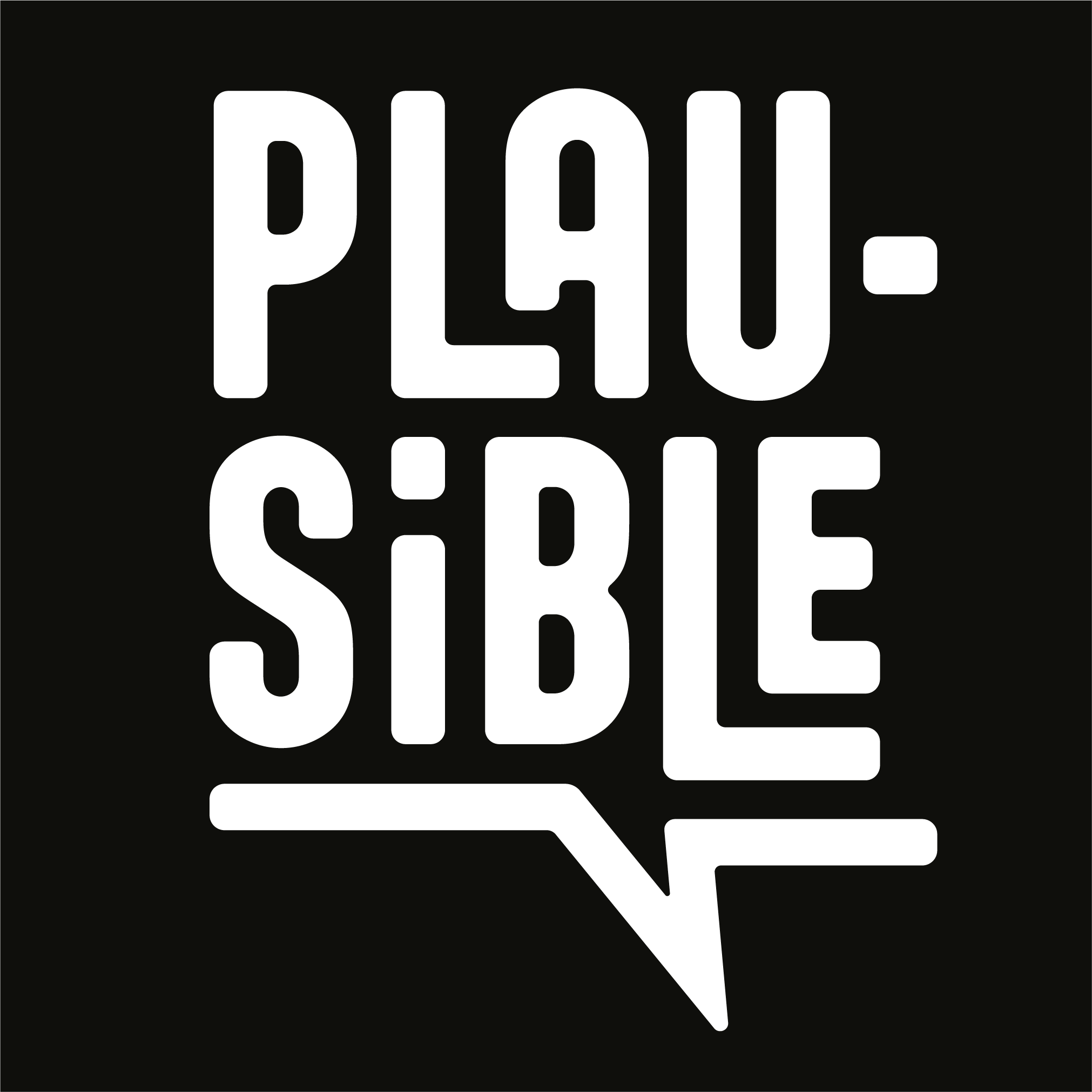
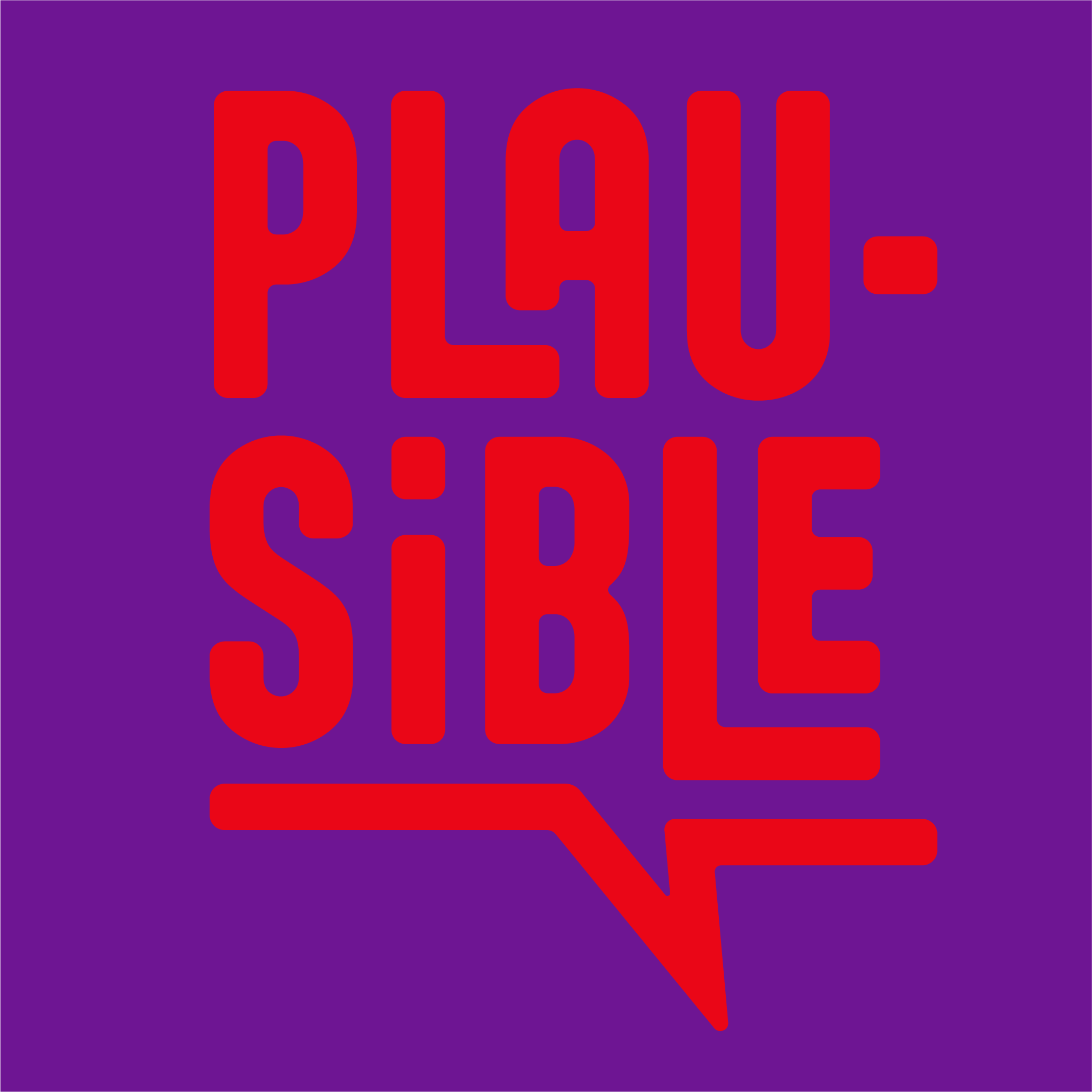
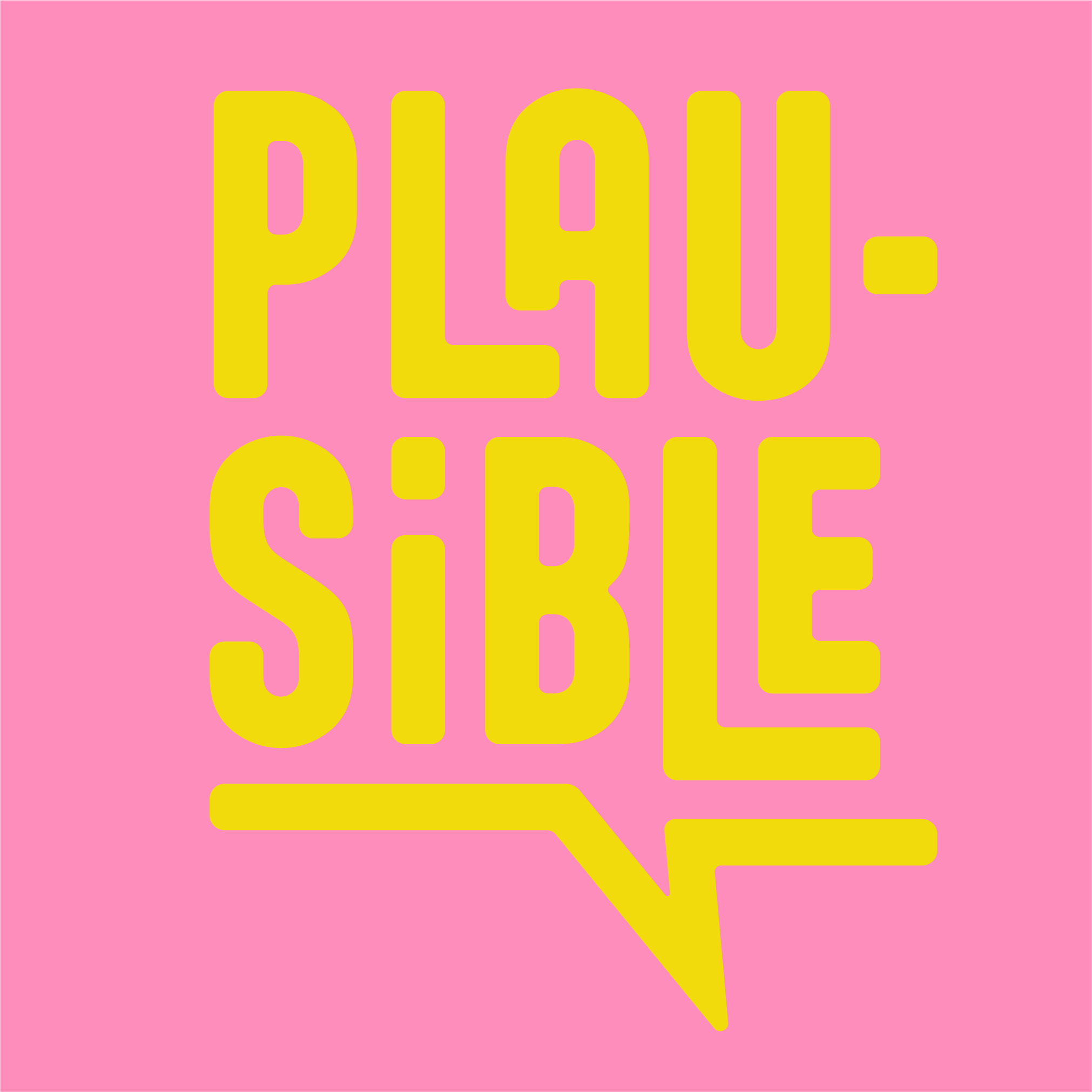
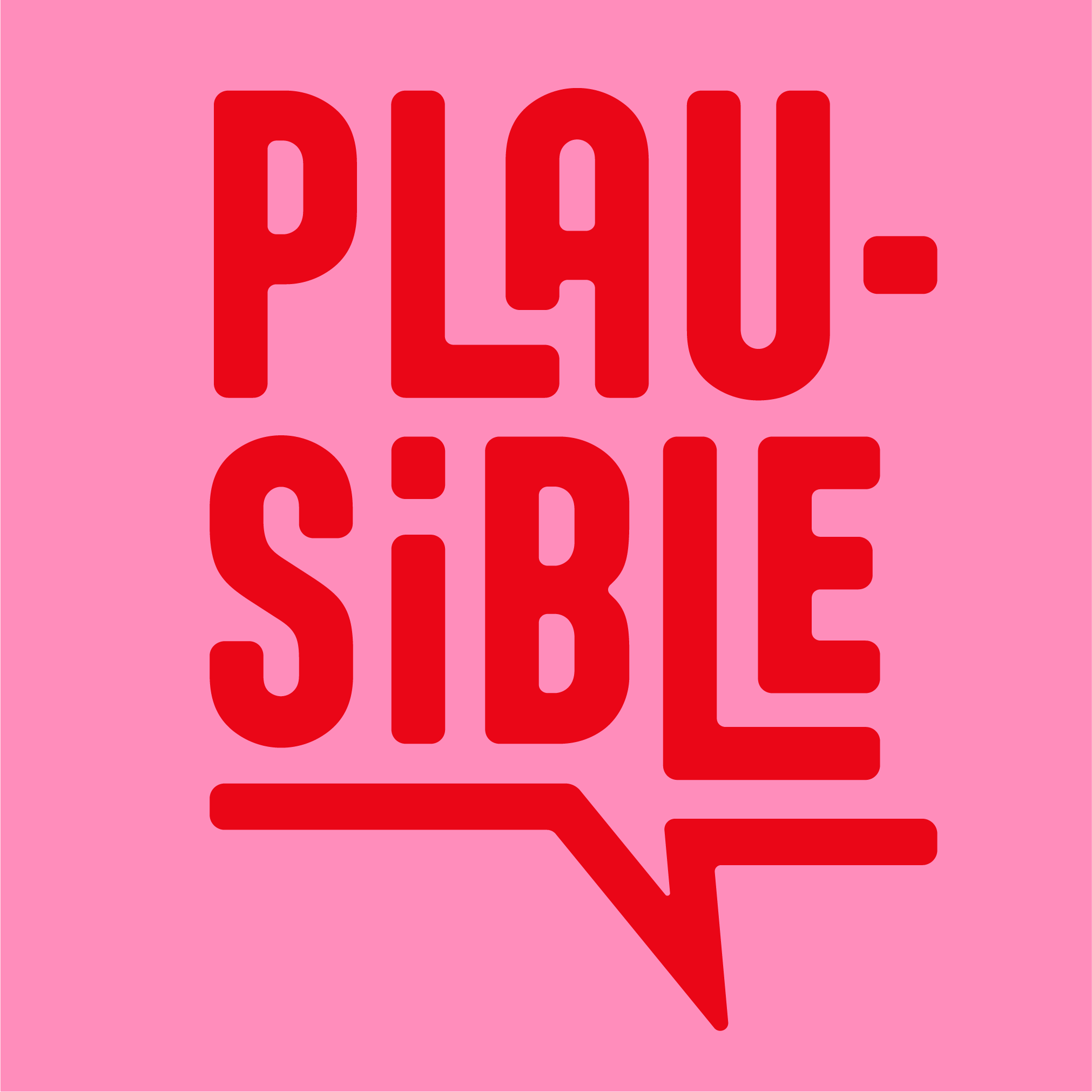
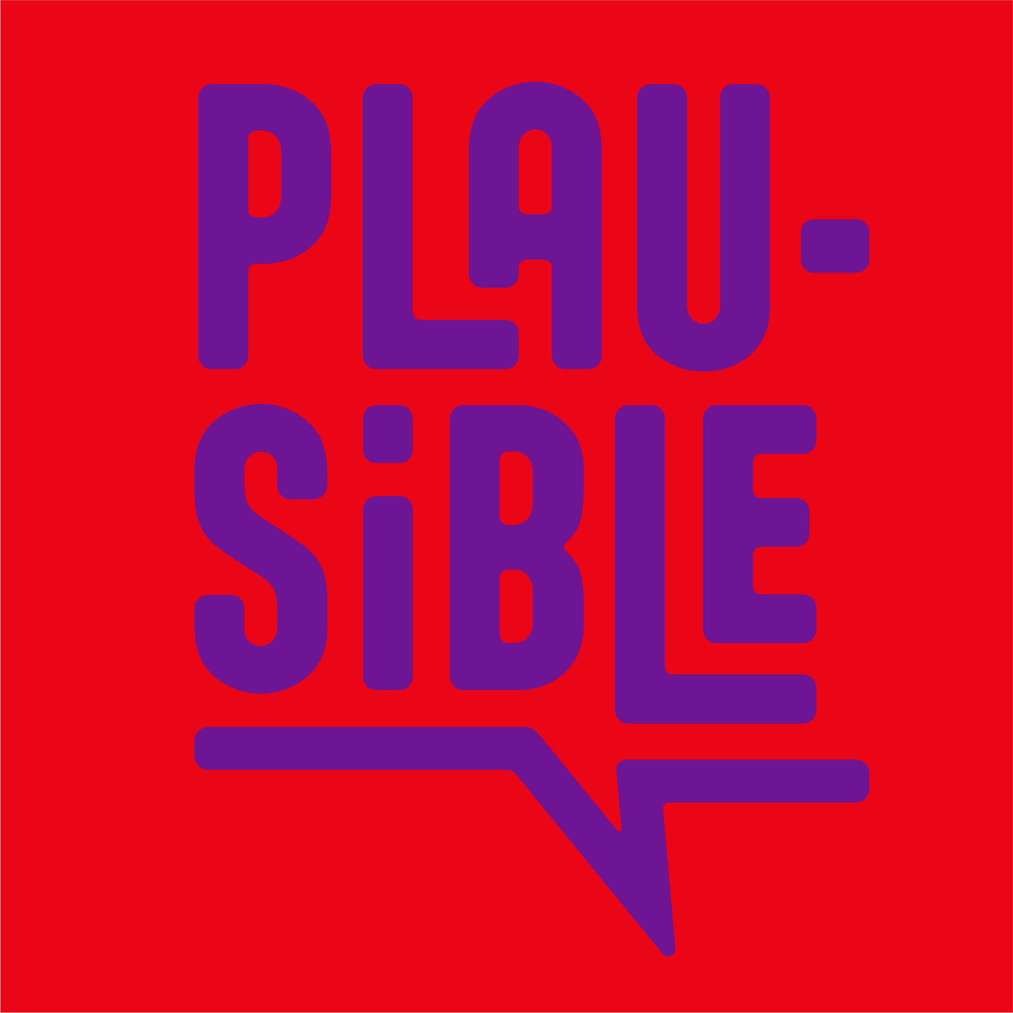
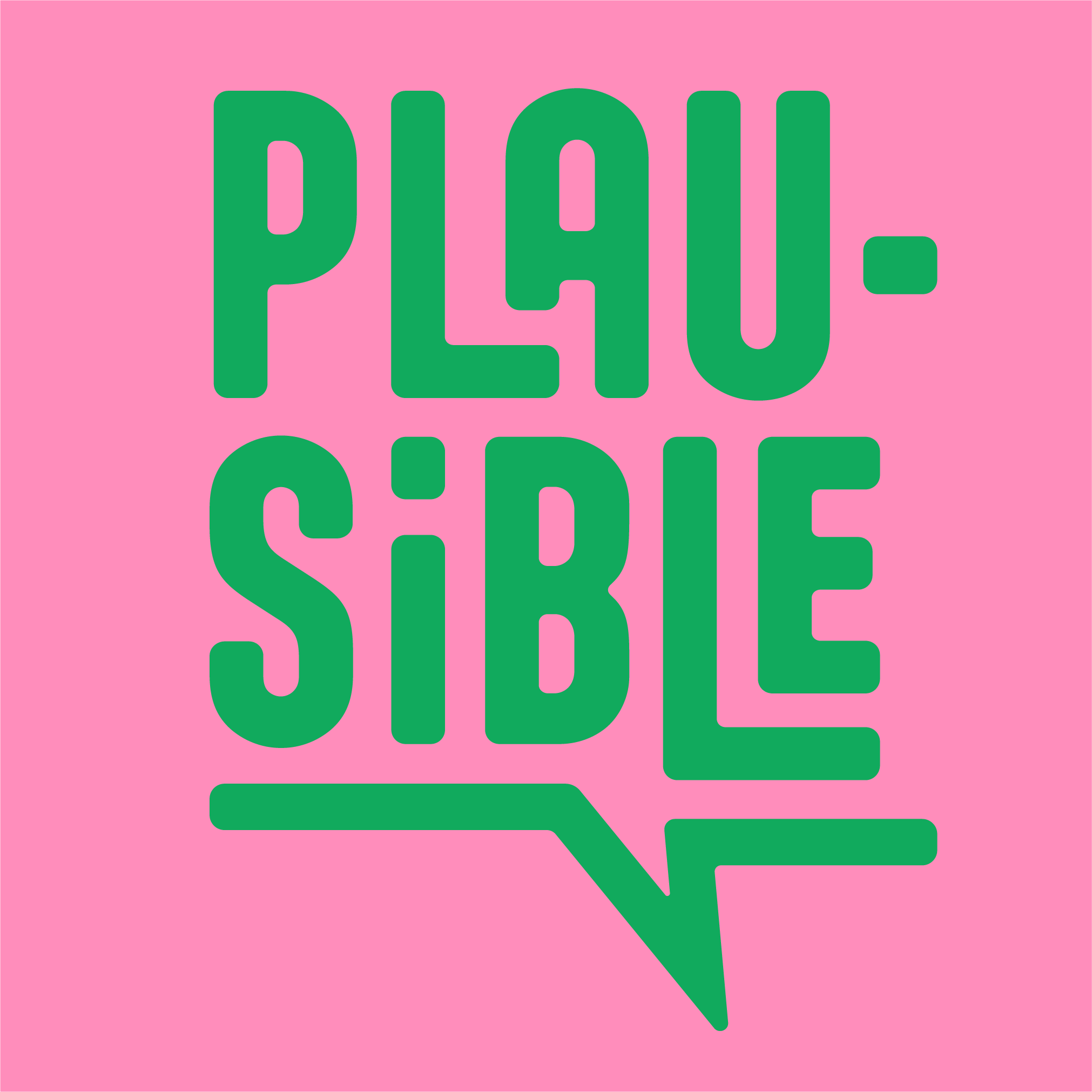
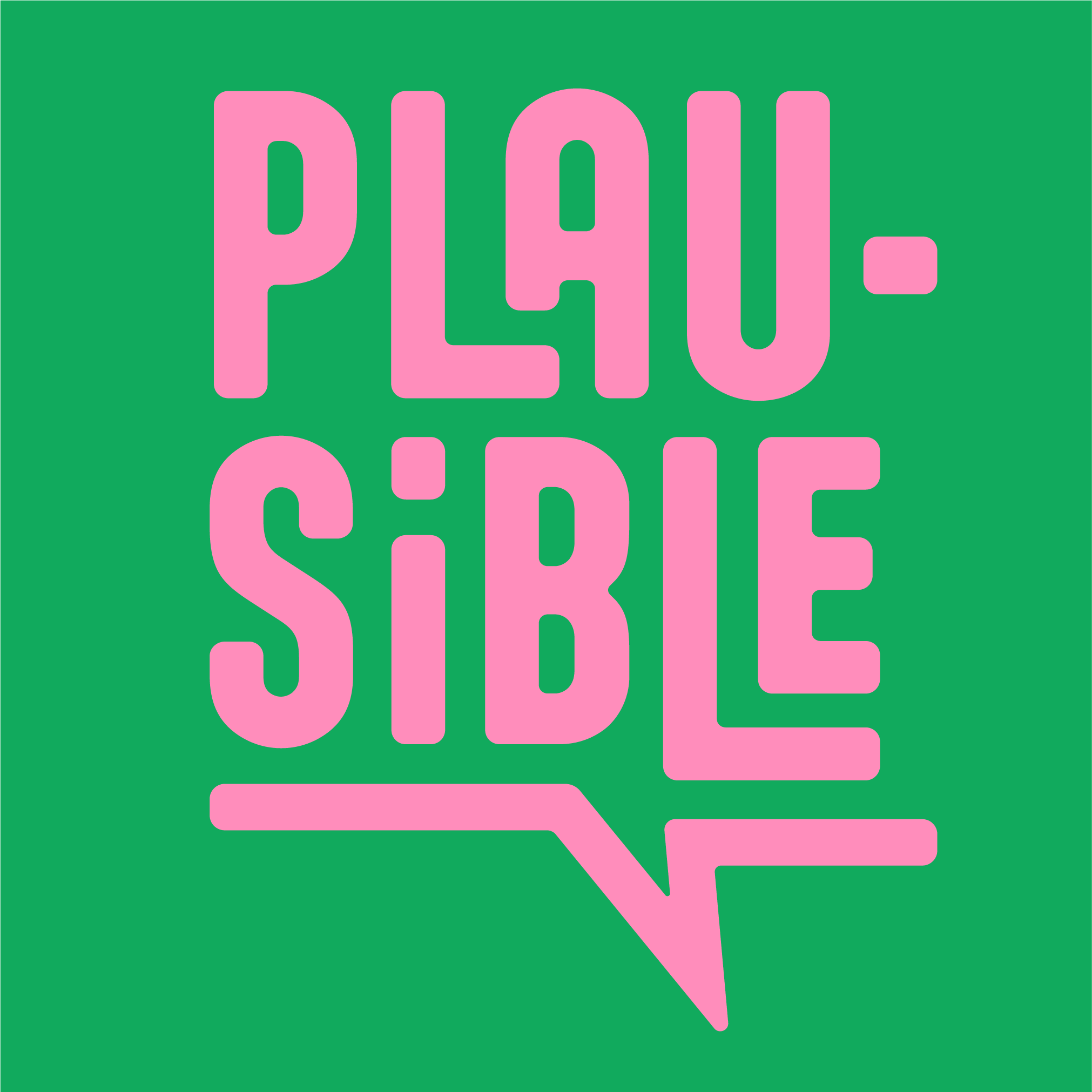
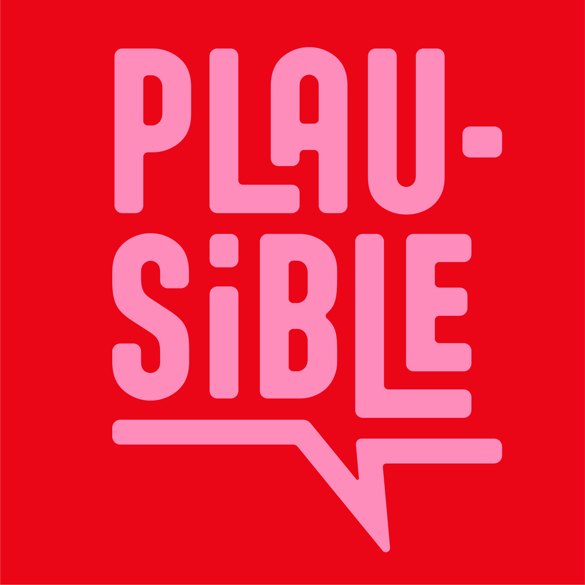
The Logo
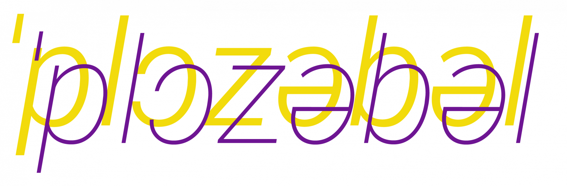
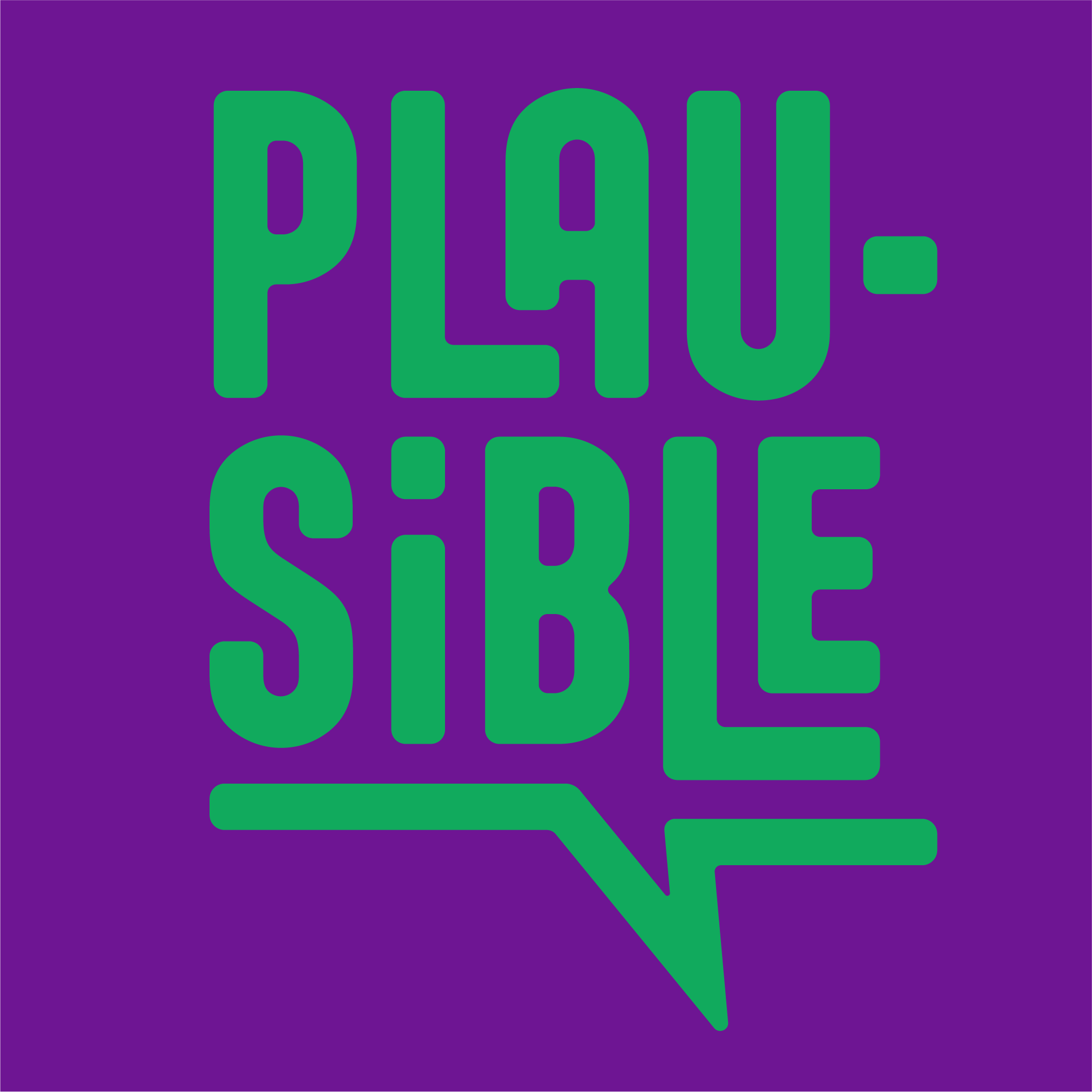
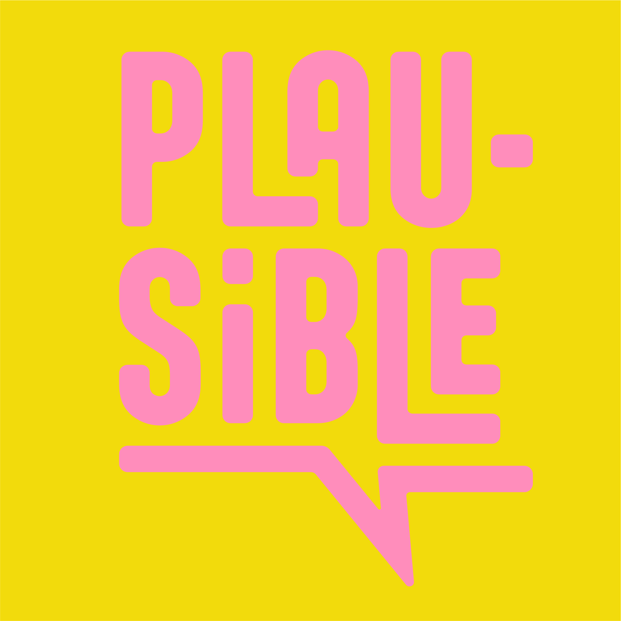
The name Plausible combines parts of my first name and surname, and reflects a core belief in my design work: that clarity, structure, and feeling belong together.
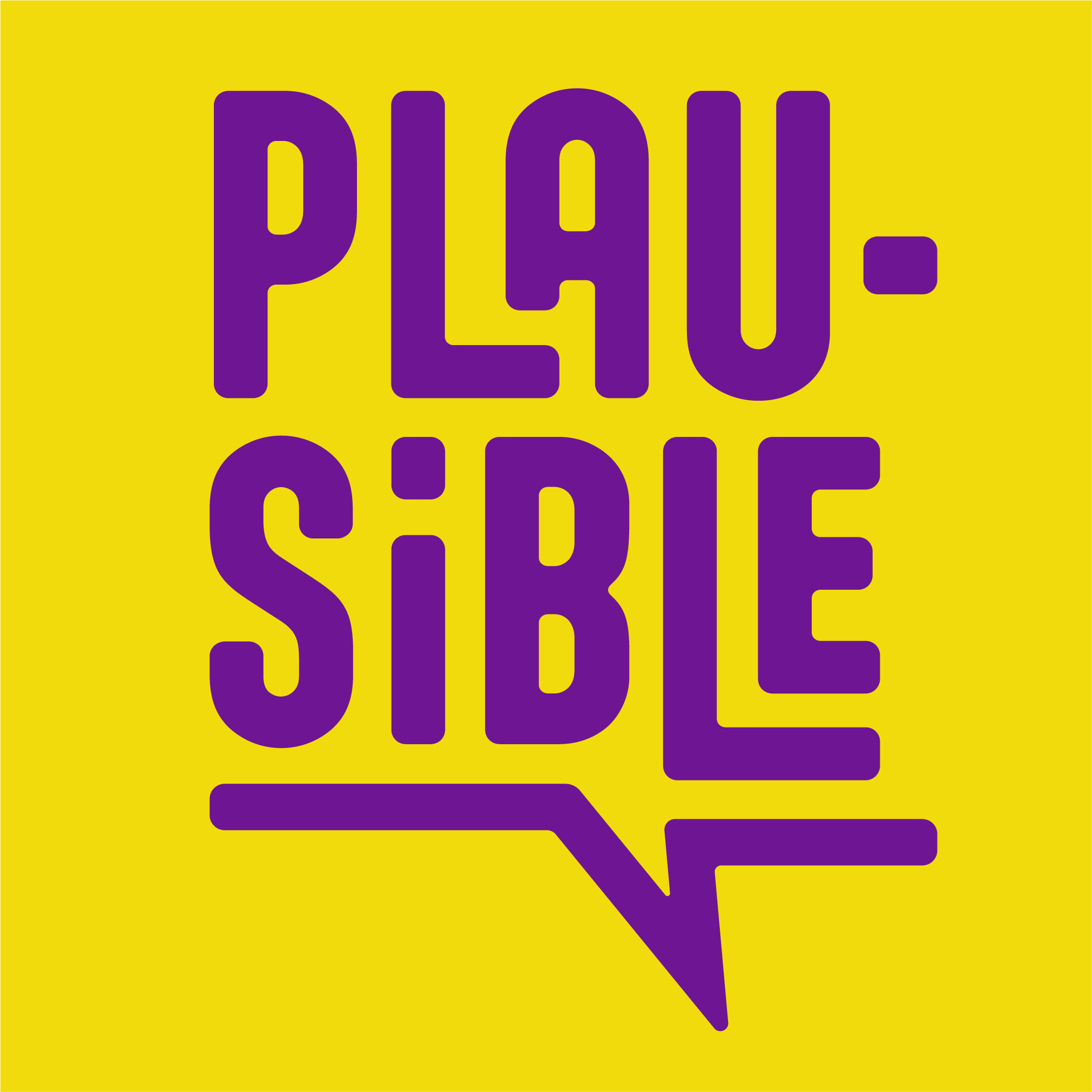
The logo is built like a typesetting box — each letter placed deliberately, forming a compact, balanced whole. This layout speaks to a design process that values logic and intuition in equal measure.
The speech bubble detail emphasizes communication as the heart of design: making ideas not only visible, but understandable.
Due to scalability, the padding is not defined in pixels but in fractions instead. The padding around the logo should at least be one tenth of its overall width as shown in the examples on the right.
Colours
I believe that good design can be fun and joyful as well as political. This mindset inspired my colour choices and naming decisions. Some of these colours and possible combinations are based on historically and culturally relevant movements in addition to pop culture and the current zeitgeist.
It should however be noted that not all possible combinations foster ideal readability and should therefore be avoided in an effort to improve acessibility.
This is especially relevant for text.
Suffrage Acaii
#6e1593
C: 75% M: 98% Y: 0% K: 0%
R: 110 G: 21 B: 147
H: 282° S: 85% L: 57%
Fellow Ozians
#11aa5d
C: 78% M: 0% Y: 80% K: 0%
R: 17 G: 170 B: 93
H: 149° S: 89% L: 66%
S. Baudelaire
#f2db0c
C: 9% M: 7% Y: 93% K: 0%
R: 242 G: 219 B: 12
H: 53° S: 94% L: 94%
Bubbly
#ff8dbb
C: 0% M: 58% Y: 0% K: 0%
R: 255 G: 141 B: 187
H: 334° S: 44% L: 100%
Resistance Red
#ea0617
C: 0% M: 98% Y: 93% K: 0%
R: 234 G: 6 B: 23
H: 354° S: 97% L: 91%
Typography
For my logo as well as headings I use a modified version of the typeface Aptly.
Aptly is a geometric sans-serif typeface that blends structure with softness. Its letters are made mostly from smooth, circular shapes and straight lines, with almost no sharp corners or diagonals. This gives it a clean, modern feel — like the type was drawn with a rounded tool or routed out of a surface. Despite its precise, technical look, Aptly has a warm, approachable quality. The balance between strict design rules and gentle curves creates a subtle tension that makes the font feel both engineered and human. It was designed by Nick Shinn.
For subheadings, texts and buttons, I use the Roboto typeface. This is mostly due to readability and the ability to display characters used in the international phonetic alphabet (IPA).
Roboto is a sans-serif typeface designed by Christian Robertson and released by Google in 2011 as the system font for Android. It combines elements of geometric and grotesque typefaces, with a mechanical structure and largely uniform stroke widths. The letterforms have open curves and a tall x-height, which improves readability on screens. While mostly rigid in structure, Roboto includes some humanist features, such as softened terminals and subtle optical adjustments. It was designed to perform well across digital interfaces and remains one of the most widely used typefaces in web and app design.
Aptly Bold 80px
used for H1 elements like website title, scaled accordingly for mobile version of website
Aptly Bold 50px
used for H2 elements like section headings, scaled accordingly for mobile version of website
Aptly Bold 30px
used for subheadings, capital letters
buttons use Roboto Slab bold 20px
functional buttons include hover animations for easier navigation
Roboto Slab regular 16px
used for body text as shown on the left
Visual Assets
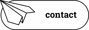
In addition to the logo, I created custom elements for this website. These include a cursor with 2 states (regular and hover/click), colourful shapes that can be combined and several small black and white illustrations in a playful but simple style.
